Bootstrap Alert component with a variety of options to provide unique looking Alert components that matches Keen's design standards.
Provide contextual feedback messages for typical user actions with the handful of available and flexible alert messages.
                        <div class="alert alert-primary" role="alert">
                            A simple primary alert—check it out!
                        </div>
                        <div class="alert alert-secondary" role="alert">
                            A simple secondary alert—check it out!
                        </div>
                        <div class="alert alert-success" role="alert">
                            A simple success alert—check it out!
                        </div>
                        <div class="alert alert-danger" role="alert">
                            A simple danger alert—check it out!
                        </div>
                        <div class="alert alert-warning" role="alert">
                            A simple warning alert—check it out!
                        </div>
                        <div class="alert alert-info" role="alert">
                            A simple info alert—check it out!
                        </div>
                        <div class="alert alert-light" role="alert">
                            A simple light alert—check it out!
                        </div>
                        <div class="alert alert-dark" role="alert">
                            A simple dark alert—check it out!
                        </div>
Use the .alert-link utility class to quickly provide matching colored links within any alert.
                        <div class="alert alert-primary" role="alert">
                            A simple primary alert with <a href="#" class="alert-link">an example link</a>. Give it a click if you like.
                        </div>
                        <div class="alert alert-secondary" role="alert">
                            A simple secondary alert with <a href="#" class="alert-link">an example link</a>. Give it a click if you like.
</div> Alerts can also contain additional HTML elements like headings, paragraphs and dividers.
Aww yeah, you successfully read this important alert message. This example text is going to run a bit longer so that you can see how spacing within an alert works with this kind of content.
Whenever you need to, be sure to use margin utilities to keep things nice and tidy.
Aww yeah, you successfully read this important alert message. This example text is going to run a bit longer so that you can see how spacing within an alert works with this kind of content.
Whenever you need to, be sure to use margin utilities to keep things nice and tidy.
Aww yeah, you successfully read this important alert message. This example text is going to run a bit longer so that you can see how spacing within an alert works with this kind of content.
Whenever you need to, be sure to use margin utilities to keep things nice and tidy.
                        <div class="alert alert-success mb-5 p-5" role="alert">
                            <h4 class="alert-heading">Well done!</h4>
                            <p>Aww yeah, you successfully read this important alert message. This example text is going to run a bit longer so that you can see how spacing within an alert works with this kind of content.</p>
                            <div class="border-bottom border-white opacity-20 mb-5"></div>
                            <p class="mb-0">Whenever you need to, be sure to use margin utilities to keep things nice and tidy.</p>
</div>Keen's custom alerts extends Bootstrap Alerts with more advanced layout and styling.
                        <div class="alert alert-custom alert-primary" role="alert">
                            <div class="alert-icon"><i class="flaticon-warning"></i></div>
                            <div class="alert-text">A simple primary alert—check it out!</div>
                        </div>
                        <div class="alert  alert-custom alert-secondary" role="alert">
                            <div class="alert-icon"><i class="flaticon-questions-circular-button"></i></div>
                            <div class="alert-text">A simple secondary alert—check it out!</div>
</div>Using the alert JavaScript plugin, it’s possible to dismiss any alert.
                        <div class="alert alert-custom alert-primary fade show" role="alert">
                            <div class="alert-icon"><i class="flaticon-warning"></i></div>
                            <div class="alert-text">A simple primary alert—check it out!</div>
                            <div class="alert-close">
                                <button type="button" class="close" data-dismiss="alert" aria-label="Close">
                                    <span aria-hidden="true"><i class="ki ki-close"></i></span>
                                </button>
                            </div>
                        </div>
Use alert-outline-{color} to have outline styled alerts.
                        <div class="alert alert-custom alert-outline-primary fade show mb-5" role="alert">
                            <div class="alert-icon"><i class="flaticon-warning"></i></div>
                            <div class="alert-text">A simple primary alert—check it out!</div>
                            <div class="alert-close">
                                <button type="button" class="close" data-dismiss="alert" aria-label="Close">
                                    <span aria-hidden="true"><i class="ki ki-close"></i></span>
                                </button>
                            </div>
                        </div>
Use alert-outline-2 to increase the border width.
                        <div class="alert alert-custom alert-outline-2x alert-outline-primary fade show mb-5" role="alert">
                            <div class="alert-icon"><i class="flaticon-warning"></i></div>
                            <div class="alert-text">A simple primary alert—check it out!</div>
                            <div class="alert-close">
                                <button type="button" class="close" data-dismiss="alert" aria-label="Close">
                                    <span aria-hidden="true"><i class="ki ki-close"></i></span>
                                </button>
                            </div>
                        </div>
Use alert-light-{color} to have light style alerts.
                        <div class="alert alert-custom alert-light-primary fade show mb-5" role="alert">
                            <div class="alert-icon"><i class="flaticon-warning"></i></div>
                            <div class="alert-text">A simple primary alert—check it out!</div>
                            <div class="alert-close">
                                <button type="button" class="close" data-dismiss="alert" aria-label="Close">
                                    <span aria-hidden="true"><i class="ki ki-close"></i></span>
                                </button>
                            </div>
                        </div>
Use alert-notice alert-light-{color} to have notice styled alerts.
                        <div class="alert alert-custom alert-notice alert-light-primary fade show" role="alert">
                            <div class="alert-icon"><i class="flaticon-warning"></i></div>
                            <div class="alert-text">A simple primary alert—check it out!</div>
                            <div class="alert-close">
                                <button type="button" class="close" data-dismiss="alert" aria-label="Close">
                                    <span aria-hidden="true"><i class="ki ki-close"></i></span>
                                </button>
                            </div>
                        </div>
Use alert-shadow to have an alert with shadow. Also .shadow-sm, .shadow and .shadow-lg classes can be used to adjust the shadow size.
                        <div class="alert alert-custom alert-white alert-shadow fade show" role="alert">
                            ...
                        </div>

                        <div class="alert alert-custom alert-white shadow-sm fade show" role="alert">
                        ...
                        </div>

                        <div class="alert alert-custom alert-white shadow fade show" role="alert">
                        ...
                        </div>

                        <div class="alert alert-custom alert-white shadow-lg fade show" role="alert">
                        ...
                        </div>


Lorem Ipsum is simply dummy text of the printing and industry.
There are many variations of passages of Lorem Ipsum available.
Contrary to popular belief, Lorem Ipsum is not simply random text.
If you are going to use a passage of Lorem Ipsum, you need.
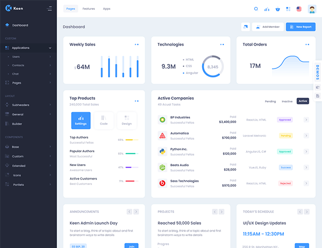
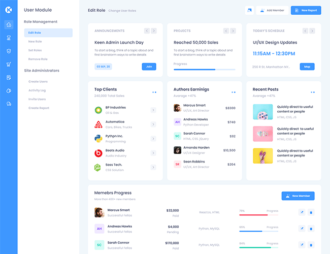
To start a blog, think of a topic about and first brainstorm ways to write details
To start a blog, think of a topic about and first brainstorm ways to write details
To start a blog, think of a topic about and first brainstorm ways to write details
To start a blog, think of a topic about and first brainstorm ways to write details