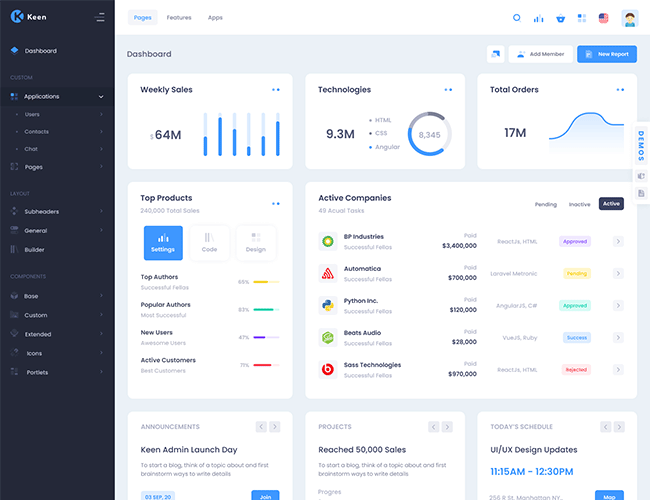
Bootstrap Progress component with a variety of options to provide unique looking Progress components that matches Keen's design standards.
Bootstrap Progress components are built with two HTML elements, some CSS to set the width, and a few attributes.
                        <div class="progress">
                            <div class="progress-bar" role="progressbar" aria-valuenow="0" aria-valuemin="0" aria-valuemax="100"></div>
                        </div>
                        <div class="progress">
                            <div class="progress-bar" role="progressbar" style="width: 25%" aria-valuenow="25" aria-valuemin="0" aria-valuemax="100"></div>
                        </div>
                        <div class="progress">
                            <div class="progress-bar" role="progressbar" style="width: 50%" aria-valuenow="50" aria-valuemin="0" aria-valuemax="100"></div>
                        </div>
                        <div class="progress">
                            <div class="progress-bar" role="progressbar" style="width: 75%" aria-valuenow="75" aria-valuemin="0" aria-valuemax="100"></div>
                        </div>
                        <div class="progress">
                            <div class="progress-bar" role="progressbar" style="width: 100%" aria-valuenow="100" aria-valuemin="0" aria-valuemax="100"></div>
                        </div>
Add labels to your progress bars by placing text within the .progress-bar.
                        <div class="progress">
                            <div class="progress-bar" role="progressbar" style="width: 75%;" aria-valuenow="75" aria-valuemin="0" aria-valuemax="100">75%</div>
                        </div>
Change the height value within the progress element and the inner .progress-bar will automatically resize.
                        <div class="progress" style="height: 1px;">
                            <div class="progress-bar" role="progressbar" style="width: 25%;" aria-valuenow="25" aria-valuemin="0" aria-valuemax="100"></div>
                        </div>

                        <div class="progress" style="height: 5px;">
                            <div class="progress-bar" role="progressbar" style="width: 25%;" aria-valuenow="25" aria-valuemin="0" aria-valuemax="100"></div>
                        </div>

                        <div class="progress" style="height: 10px;">
                            <div class="progress-bar" role="progressbar" style="width: 25%;" aria-valuenow="25" aria-valuemin="0" aria-valuemax="100"></div>
                        </div>

                        <div class="progress" style="height: 20px;">
                            <div class="progress-bar" role="progressbar" style="width: 25%;" aria-valuenow="25" aria-valuemin="0" aria-valuemax="100"></div>
</div>Use background utility classes to change the appearance of individual progress bars.
                        <div class="progress">
                            <div class="progress-bar bg-success" role="progressbar" style="width: 25%" aria-valuenow="25" aria-valuemin="0" aria-valuemax="100"></div>
                        </div>
                        <div class="progress">
                            <div class="progress-bar bg-primary" role="progressbar" style="width: 50%" aria-valuenow="50" aria-valuemin="0" aria-valuemax="100"></div>
                        </div>
                        <div class="progress">
                            <div class="progress-bar bg-warning" role="progressbar" style="width: 75%" aria-valuenow="75" aria-valuemin="0" aria-valuemax="100"></div>
                        </div>
                        <div class="progress">
                            <div class="progress-bar bg-danger" role="progressbar" style="width: 100%" aria-valuenow="100" aria-valuemin="0" aria-valuemax="100"></div>
</div>Include multiple progress bars in a progress component if you need.
                        <div class="progress">
                            <div class="progress-bar" role="progressbar" style="width: 15%" aria-valuenow="15" aria-valuemin="0" aria-valuemax="100"></div>
                            <div class="progress-bar bg-success" role="progressbar" style="width: 30%" aria-valuenow="30" aria-valuemin="0" aria-valuemax="100"></div>
                            <div class="progress-bar bg-primary" role="progressbar" style="width: 20%" aria-valuenow="20" aria-valuemin="0" aria-valuemax="100"></div>
                        </div>
Add .progress-bar-striped to any .progress-bar to apply a stripe via CSS gradient over the progress bar’s background color.
                        <div class="progress">
                            <div class="progress-bar progress-bar-striped" role="progressbar" style="width: 10%" aria-valuenow="10" aria-valuemin="0" aria-valuemax="100"></div>
                        </div>
                        <div class="progress">
                            <div class="progress-bar progress-bar-striped bg-success" role="progressbar" style="width: 25%" aria-valuenow="25" aria-valuemin="0" aria-valuemax="100"></div>
                        </div>
                        <div class="progress">
                            <div class="progress-bar progress-bar-striped bg-primary" role="progressbar" style="width: 50%" aria-valuenow="50" aria-valuemin="0" aria-valuemax="100"></div>
                        </div>
                        <div class="progress">
                            <div class="progress-bar progress-bar-striped bg-warning" role="progressbar" style="width: 75%" aria-valuenow="75" aria-valuemin="0" aria-valuemax="100"></div>
                        </div>
                        <div class="progress">
                            <div class="progress-bar progress-bar-striped bg-danger" role="progressbar" style="width: 100%" aria-valuenow="100" aria-valuemin="0" aria-valuemax="100"></div>
                        </div>
The striped gradient can also be animated. Add .progress-bar-animated to .progress-bar to animate the stripes right to left via CSS3 animations.
                        <div class="progress">
                            <div class="progress-bar progress-bar-striped progress-bar-animated " role="progressbar" style="width: 10%" aria-valuenow="10" aria-valuemin="0" aria-valuemax="100"></div>
                        </div>
                        <div class="progress">
                            <div class="progress-bar progress-bar-striped progress-bar-animated bg-success" role="progressbar" style="width: 25%" aria-valuenow="25" aria-valuemin="0" aria-valuemax="100"></div>
                        </div>
                        <div class="progress">
                            <div class="progress-bar progress-bar-striped progress-bar-animated bg-primary" role="progressbar" style="width: 50%" aria-valuenow="50" aria-valuemin="0" aria-valuemax="100"></div>
                        </div>
                        <div class="progress">
                            <div class="progress-bar progress-bar-striped progress-bar-animated bg-warning" role="progressbar" style="width: 75%" aria-valuenow="75" aria-valuemin="0" aria-valuemax="100"></div>
                        </div>
                        <div class="progress">
                            <div class="progress-bar progress-bar-striped progress-bar-animated bg-danger" role="progressbar" style="width: 100%" aria-valuenow="100" aria-valuemin="0" aria-valuemax="100"></div>
                        </div>


Lorem Ipsum is simply dummy text of the printing and industry.
There are many variations of passages of Lorem Ipsum available.
Contrary to popular belief, Lorem Ipsum is not simply random text.
If you are going to use a passage of Lorem Ipsum, you need.
To start a blog, think of a topic about and first brainstorm ways to write details
To start a blog, think of a topic about and first brainstorm ways to write details
To start a blog, think of a topic about and first brainstorm ways to write details
To start a blog, think of a topic about and first brainstorm ways to write details